 "Rusty Vandura - www.tinyurl.com/keepoppo" (rustyvandura)
11/14/2016 at 09:50 • Filed to: None
 1
1
 40
40|
"Rusty Vandura - www.tinyurl.com/keepoppo" (rustyvandura)
11/14/2016 at 09:50 • Filed to: None | 1
| 40 |
 TheTurbochargedSquirrel
> Rusty Vandura - www.tinyurl.com/keepoppo
TheTurbochargedSquirrel
> Rusty Vandura - www.tinyurl.com/keepoppo
11/14/2016 at 09:56 |
|
 jimz
> Rusty Vandura - www.tinyurl.com/keepoppo
jimz
> Rusty Vandura - www.tinyurl.com/keepoppo
11/14/2016 at 09:57 |
|
And?
the rise in overdoses stem directly from the overprescription of narcotic painkillers. it has nothing to do with the way people voted.
 Demon-Xanth knows how to operate a street.
> Rusty Vandura - www.tinyurl.com/keepoppo
Demon-Xanth knows how to operate a street.
> Rusty Vandura - www.tinyurl.com/keepoppo
11/14/2016 at 09:58 |
|
http://tylervigen.com/spurious-correlations
These have better correlation than that map.
 nermal
> Rusty Vandura - www.tinyurl.com/keepoppo
nermal
> Rusty Vandura - www.tinyurl.com/keepoppo
11/14/2016 at 09:59 |
|
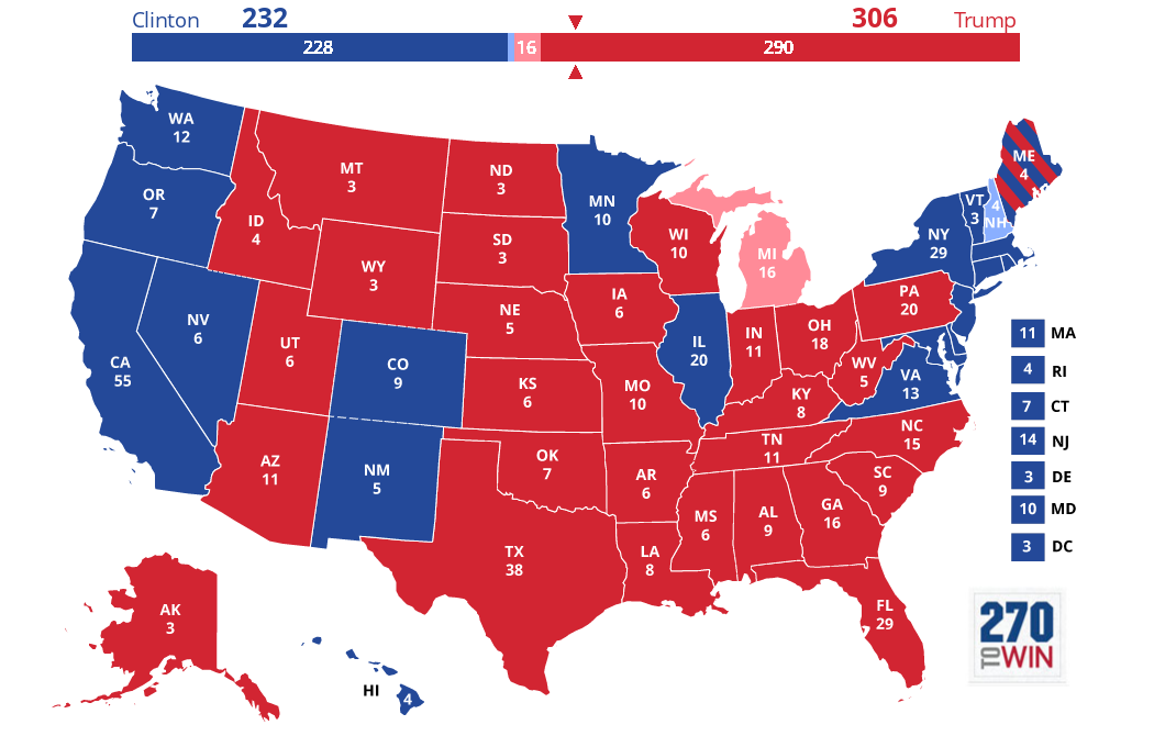
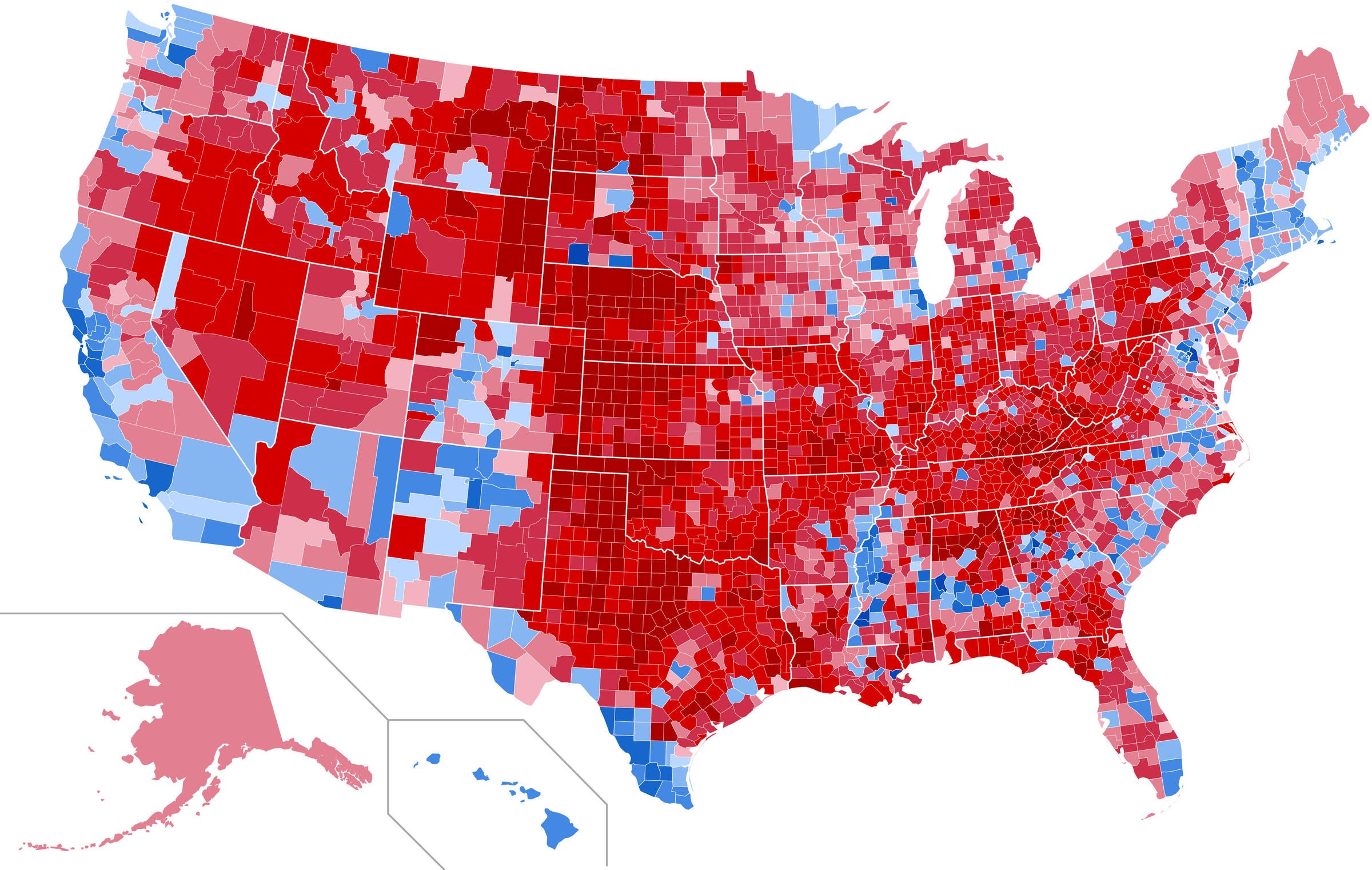
Comparing a state map to a county map is horse poo. What point are you trying to make? From what I see, some of the higher OD areas are very blue, some very red.
This is the 2016 election map by county for reference:
 vondon302
> Rusty Vandura - www.tinyurl.com/keepoppo
vondon302
> Rusty Vandura - www.tinyurl.com/keepoppo
11/14/2016 at 10:00 |
|
So all the Obama Democrats died of drug overdoses?
|
Rusty Vandura - www.tinyurl.com/keepoppo
> vondon302
11/14/2016 at 10:02 |
|
Don’t be a dick.
|
Rusty Vandura - www.tinyurl.com/keepoppo
> nermal
11/14/2016 at 10:03 |
|
Draw your own conclusions.
 marshknute
> Rusty Vandura - www.tinyurl.com/keepoppo
marshknute
> Rusty Vandura - www.tinyurl.com/keepoppo
11/14/2016 at 10:04 |
|
Not really seeing any correlation there. Tons of overdoses along the southern border, the Midwest, and every state west of the Rockies.
|
Rusty Vandura - www.tinyurl.com/keepoppo
> nermal
11/14/2016 at 10:05 |
|
Makes a more compelling juxtaposition than what I posted.
|
Rusty Vandura - www.tinyurl.com/keepoppo
> marshknute
11/14/2016 at 10:10 |
|
Look at the comparison by county.
 71MGBGT Likes Subarus of Unusual Colors
> Rusty Vandura - www.tinyurl.com/keepoppo
71MGBGT Likes Subarus of Unusual Colors
> Rusty Vandura - www.tinyurl.com/keepoppo
11/14/2016 at 10:10 |
|
 Trevor Slattery, ACTOR
> Rusty Vandura - www.tinyurl.com/keepoppo
Trevor Slattery, ACTOR
> Rusty Vandura - www.tinyurl.com/keepoppo
11/14/2016 at 10:13 |
|
Make it simple. In 2014 there were about 30,000 ODs from Opioids.
Blacks: 1,500 approx
Latinos: 1,000 approx
Whites: 27,500 approx.
|
Rusty Vandura - www.tinyurl.com/keepoppo
> 71MGBGT Likes Subarus of Unusual Colors
11/14/2016 at 10:16 |
|
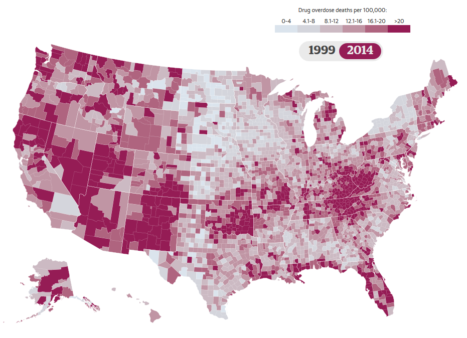
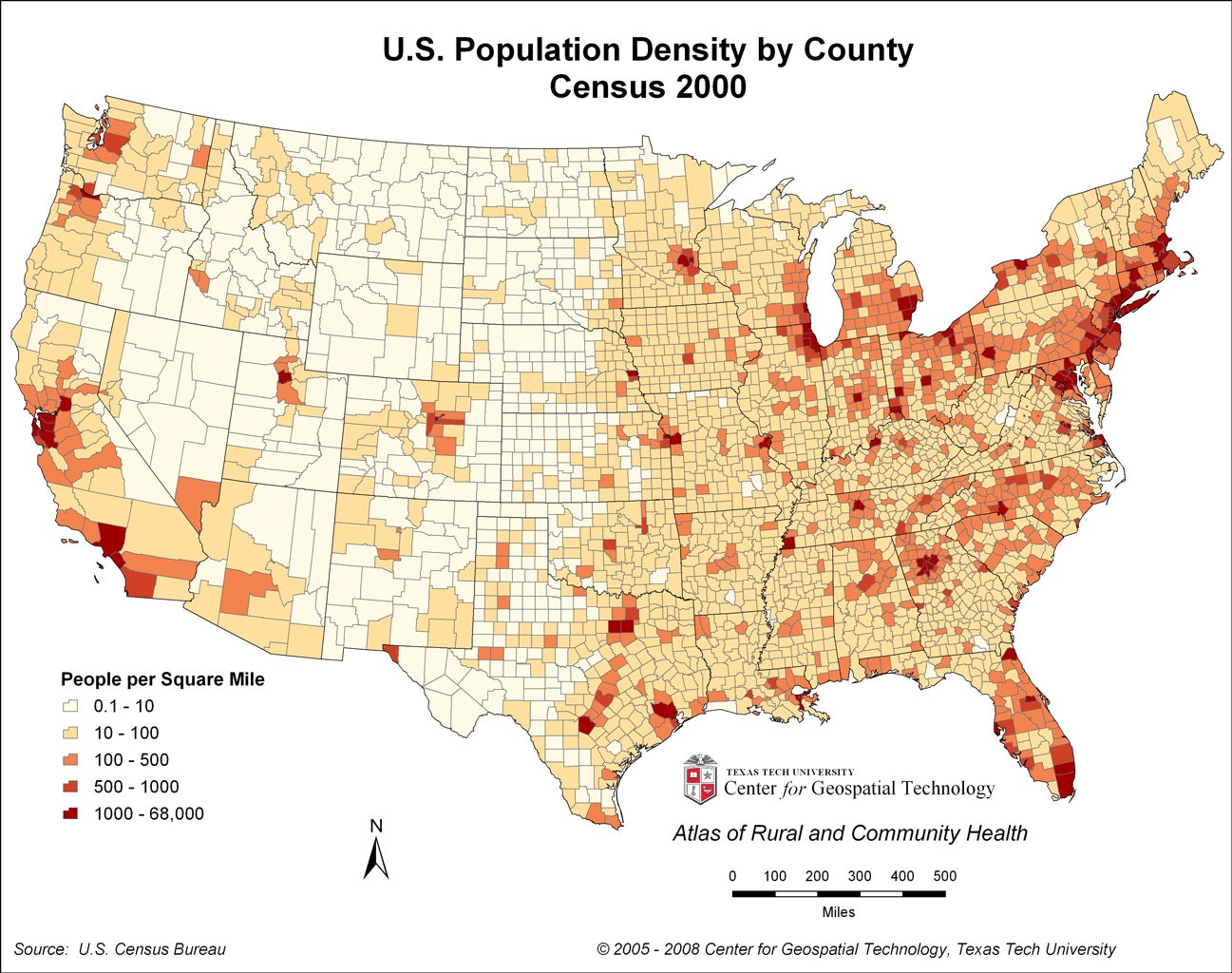
Wow. The drug overdose death chart is normalized for population density in that it reports deaths per 100,000 people. My comparison of that map to the one you share suggests that the drug deaths are taking place in sparsely populated areas.
I deliberately posted the maps without comment because I wanted to see what conclusions thoughtful Oppos would draw and share. I have not been disappointed.
|
vondon302
> Rusty Vandura - www.tinyurl.com/keepoppo
11/14/2016 at 10:18 |
|
Wasn’t trying but.....
 BorkBorkBjork
> Rusty Vandura - www.tinyurl.com/keepoppo
BorkBorkBjork
> Rusty Vandura - www.tinyurl.com/keepoppo
11/14/2016 at 10:18 |
|
Clearly, there are bigger issues afoot. The frosty white menace must be stopped!
|
Demon-Xanth knows how to operate a street.
> Rusty Vandura - www.tinyurl.com/keepoppo
11/14/2016 at 10:20 |
|
People in more densely populated areas have more immediate access to medical services and thus are more likely to survive.
|
Demon-Xanth knows how to operate a street.
> Trevor Slattery, ACTOR
11/14/2016 at 10:24 |
|
Those numbers correspond fairly well to the actual population breakdown, however shows that whites are more likely to OD than other races by a significant factor. (90% of ODs vs. 75% of population)
|
Rusty Vandura - www.tinyurl.com/keepoppo
> vondon302
11/14/2016 at 10:24 |
|
Fair enough. Thanks for replying. I just wasn’t trying to foist any conclusions with my post, but I wasn’t seeing any humor, either.
|
Rusty Vandura - www.tinyurl.com/keepoppo
> BorkBorkBjork
11/14/2016 at 10:25 |
|
And the issues overlap, it would seem.
|
Rusty Vandura - www.tinyurl.com/keepoppo
> Demon-Xanth knows how to operate a street.
11/14/2016 at 10:25 |
|
Excellent point.
 TheRealBicycleBuck
> Rusty Vandura - www.tinyurl.com/keepoppo
TheRealBicycleBuck
> Rusty Vandura - www.tinyurl.com/keepoppo
11/14/2016 at 10:27 |
|
What’s the point of the 1999 on the first map. Is the time period supposed to be from 1999 to 2014? There’s also an issue with the top end of the scale. “>20" could be anything from 21 to 100,000. I want to see the statistics for that category.
|
vondon302
> Rusty Vandura - www.tinyurl.com/keepoppo
11/14/2016 at 10:30 |
|
Humor is the only way I can cope with our current politics. Didn’t mean to come off dicky but I see what ya mean.
|
BorkBorkBjork
> Rusty Vandura - www.tinyurl.com/keepoppo
11/14/2016 at 10:31 |
|
Statistics is very complicated, and any study that has to do with human behavior is stupendously unreliable. Things like “confounding variables” mean that it is basically impossible to find out anything about human behavior, especially if it relies on self-reporting (when’s the last time you told your doctor the truth about how much you drank?). Cracked has a very good podcast about this very subject, it is worth a listen.
http://www.earwolf.com/episode/why-science-has-really-basic-stuff-wrong-about-humans/
|
Rusty Vandura - www.tinyurl.com/keepoppo
> TheRealBicycleBuck
11/14/2016 at 10:31 |
|
I thought the pictures looked startlingly alike. Oppo comments have been thoughtful. Actual conclusions have been few. If a case can be made why the similar-looking pictures cannot draw any conclusions, then please make it. Here’s the link to the purple map:
https://www.theguardian.com/society/ng-interactive/2016/may/25/opioid-epidemic-overdose-deaths-map
 Brickman
> BorkBorkBjork
Brickman
> BorkBorkBjork
11/14/2016 at 10:42 |
|
Brain freezes make you do crazy things
|
BorkBorkBjork
> Brickman
11/14/2016 at 11:28 |
|
I was looking for an excuse to include a Mr. Freeze gif. Thanks.

Or two..
 Sneaky Pete
> BorkBorkBjork
Sneaky Pete
> BorkBorkBjork
11/14/2016 at 11:41 |
|
Ban icecream! Think of the children!
|
Rusty Vandura - www.tinyurl.com/keepoppo
> vondon302
11/14/2016 at 11:48 |
|
I’m struggling also. I appreciate your candor. If I am to draw a conclusion from the map comparison, it is that the areas that voted Trump are particularly desparate, for whatever reason.
|
TheRealBicycleBuck
> Rusty Vandura - www.tinyurl.com/keepoppo
11/14/2016 at 11:52 |
|
My first concern (as a map-maker) was the existence of the “1999" in your screencap of the map. It didn’t belong. The link to the source map cleared up that issue.
The second concern about the categories was not clarified by the link. It’s easy to skew data by presenting it visually and not being clear about the categories. By not giving the total range, it may be that they are playing with the categories to make the problem seem worse.
The third concern is looking at the data in rural versus populated areas. Even when normalized, the data can be misleading because the boundary areas are vastly different (big counties versus small) and the total population is vastly different. Think about it this way - if one guy in a town with a population of 100 dies from an overdose, their rate skews the data, even when normalized to a population of 100,000. They usually try to work around this by changing the sampling area size, but that rarely works since the typical boundaries (i.e. county boundaries) in rural states include areas that are primarily rural. In other words, it is very difficult to get around the fact that the area in question is primarily rural and sparsely populated.
Others have already pointed out the difference in areas being compared (counties versus states), so I won’t rehash their thoughts.
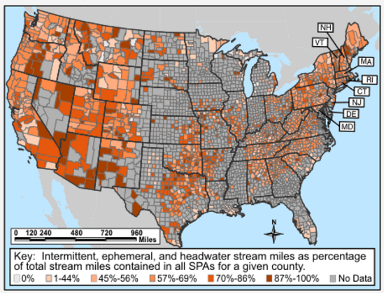
I find it interesting that there are other correlations that could be investigated. How about the percentage of surface drinking water sourced from intermittent, ephemeral, and headwater streams ( source )?
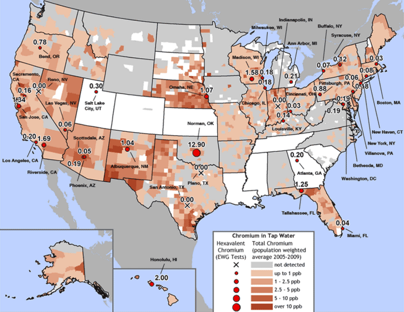
How about water contaminated by hexavalent chromium?
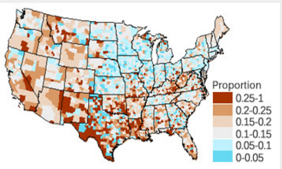
What about the proportion of the population without health insurance?
There are a whole litany of reasons there may be correlations between geospatial datasets. The only way to make a significant, statistically relevant connection is through geostatistical analysis. You might be barking up the right tree, but given that there are lots of other factors which show similar trends, I wouldn’t make any bets on it.
|
Rusty Vandura - www.tinyurl.com/keepoppo
> TheRealBicycleBuck
11/14/2016 at 12:05 |
|
Your thoughtful reply was the sort of response I was looking for when I posted these. The post came out of a Facebook post that someone in my circle made comparing a crime rate map to the electoral results. I thought of the Fentanyl overdoses that I’ve been hearing a bout and I found the purple map and the similarities were, to me, striking. I am no statistician and if the similarities are merely coincidental, then I am schooled. It’s just the the similarities are so consistent across the entire range of the maps... Hard to dismiss.
If I were going to draw my own inference from the comparison, it would simply be that counties who voted Trump are comparatively desparate.
|
TheRealBicycleBuck
> Rusty Vandura - www.tinyurl.com/keepoppo
11/14/2016 at 13:39 |
|
Glad to help.
The problem with all of these maps (and the numbers is that support them) is that most people aren’t trained to properly interpret them. Most people have no reason to take a course in statistics and even less reason to take a course in geostatistics. If you are really interested in learning more, a good place to start is by reading a couple of books: How to Lie with Maps by Mark Monmonier; and How to Lie with Statistics by Darrell Huff. Those should give you enough information to be a more critical observer of maps.
I’d like to bring up one more issue that confuses many people. It’s called kitchen sink statistics. Stats are a method of comparing one or a few independent variables (i.e. obesity) to one dependent variable (i.e. heart disease) to see if there is a mathematical relationship between the two. The idea is that we expect there to be a relationship and we want to prove that our hypothesis is correct.
A problem occurs when the statistician tests a large number of independent variables (i.e obesity, BMI, height, age, number of eggs eaten per week, number of cokes consumed per day, etc.) against one dependent variable. Statistically, if you test a hundred different independent variables, you will find one that looks like it correlates. It’s at that point the researcher should take a closer look at the independent variable that came out of the first analysis and test only that variable with a new set of data. Unfortunately, that step is skipped or the results are reported before the final verdict is known. Remember that eggs used to be bad for you? That finding was based on a kitchen sink study which was later proven to be wrong .
This is the danger in visually comparing a bunch of maps and jumping to conclusions. If a statistician were to say that there was a direct correlation between voter preference and incidents of overdosing on prescription drugs, the first question that comes to mind is: why? What relationship could there be between the two phenomenon? Can we test it statistically? What underlying cause could make this relationship true? What underlying phenomenon might be causing people who vote one way to have a higher incidence of drug overdoses?
It all reminds me of the first day of Intro to Statistics. The instructor showed us a graph which clearly indicated a positive relationship between performance on standardized tests and shoe size among 7th graders. What?!?
This is a standard thought exercise where we were challenged to come up with why shoe size might be related to intelligence and whether or not one causes the other (if you start wearing bigger shoes, will you become smarter). Of course, they don’t have a causal relationship. So what could be causing this? The underlying, unknown, confounding variable could be puberty. It stands to reason that 7th graders who have gone through puberty would have both bigger feet and a greater mental capacity. That sets the scene for running tests on the correct variable.
I say all this to help you educate your Facebook friends. Just because something looks like a duck and quacks like a duck, doesn’t mean it’s a duck. Statistics aren’t easy and proving relationships takes a lot more than a visual inspection. If it didn’t, everyone would be a statistician.
|
Brickman
> BorkBorkBjork
11/14/2016 at 13:42 |
|
Your welcome :D
|
Rusty Vandura - www.tinyurl.com/keepoppo
> TheRealBicycleBuck
11/14/2016 at 15:37 |
|
Honestly? I thought the two maps made sense that they would resemble each other. I thought the purple map supported my supposition that Trump largely got elected by bummed-out regions of the country. Real scientific sounding, eh?
I think the similarities between the two maps are startling. Further, they come from completely different sources and motivations. And times. For me, it’s sort of like looking for the bits that the New York Times and the Wall Street Journal agree upon and taking a closer look at those bits.
I have a BS in Mathematics, but I never completed a course in statistics, even though I began one three different times. In each case, I thought the book was awful and the teacher worse. And to this day when I have to present topics on elementary probability, I struggle. It just goes right over my head.
I was trolling. But not for poop; rather, conversation.
|
Rusty Vandura - www.tinyurl.com/keepoppo
> TheRealBicycleBuck
11/14/2016 at 15:40 |
|
I would expect each of these three things to be detrimental to a happy, healthy society, and it would not surprise me that all of these, plus my two, would resemble each other. Any of these maps compares visibly with the election result map and, to me, paints a picture of very unhappy pockets of the USA.
|
TheRealBicycleBuck
> Rusty Vandura - www.tinyurl.com/keepoppo
11/14/2016 at 16:02 |
|
It was conversation you got, no?
Statistics can be easy once you understand that there is an expected distribution of values based on measurements, a mathematical model to represent that distribution, and a mathematical test to see if a particular value fits within the expected range of that distribution. Now, making sense of all the formulas is another story....
|
TheRealBicycleBuck
> Rusty Vandura - www.tinyurl.com/keepoppo
11/14/2016 at 16:31 |
|
The problem with the maps are scale and location. I’ve been doing geostatistical work for a long time. Your assertion brings a couple of projects to mind. The first involved an environmental justice case regarding the siting of a nuclear waste facility. The final location selected by the state was in a rural area which was primarily hispanic. They made an environmental justice claim based on their minority status.
When we followed the legislative mandate - away from urban areas, away from the coastal zone, away from aquifer recharge zones, geologically stable soils, etc. - it came down to two counties which met the criteria. The site selection committee picked the site furthest away from an international border. There were lots of reasons for the site selection, but race/ethnicity wasn’t one of them.
The other involved an epidemiological study on the relationship between drinking water contamination and kidney disease. We found that it was damn difficult to study the relationships because HIPAA rules obscured the places where kidney patients lived when they contracted the disease and they always moved to locations where dialysis treatment was available. This skewed the results. It’s an old problem - lots of people die in hospitals since that’s where they go to seek care, making it seem like hospitals are the most dangerous places to be.
Just remember that it doesn’t take many people to skew the data when the total population is very small, even if you are trying to normalize it. That gets confounded with other factors like others have mentioned.
 Bryan doesn't drive a 1M
> TheRealBicycleBuck
Bryan doesn't drive a 1M
> TheRealBicycleBuck
11/14/2016 at 22:58 |
|
I love you.
|
TheRealBicycleBuck
> Bryan doesn't drive a 1M
11/15/2016 at 08:22 |
|
Bro hug.
 davesaddiction @ opposite-lock.com
> TheRealBicycleBuck
davesaddiction @ opposite-lock.com
> TheRealBicycleBuck
11/15/2016 at 10:13 |
|
Great stuff, from a fellow map maker.
|
TheRealBicycleBuck
> davesaddiction @ opposite-lock.com
11/15/2016 at 10:14 |
|
Thanks!